
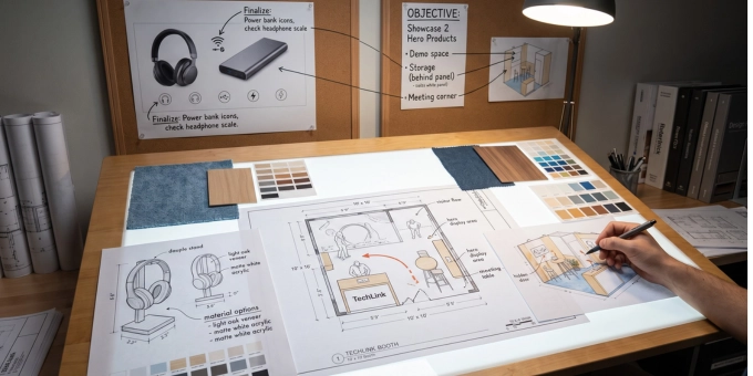
How to Design a Small Trade Show Booth That Showcases Products Without Feeling Crowded
A small trade show booth can still make a strong impression. Whether you're working with a 10’ x 10’, 10’ x 20’, or other compact space, the real challenge is rarely size. It's deciding what to show, what to leave out, and how to make the booth feel open, professional, and easy to navigate.
Many exhibitors make the mistake of trying to display everything they offer. They bring too many products, too many signs, too many brochures, and too many competing messages. The result is a booth that feels crowded and confusing, which can deter visitors from entering.
A well-designed small trade show booth works differently. It uses limited space with discipline: highlighting the right products, leaving room for conversation, and giving visitors a clear reason to stop.
Key Takeaways
- Small trade show booths work best when they have one clear objective, such as launching a product, generating leads, meeting customers, or demonstrating a solution. That goal should guide the layout, messaging, product displays, and visitor experience.
- Instead of showing every product, exhibitors should feature a small number of hero products that support sales goals, create visual impact, or start better conversations. Additional products can be handled through digital catalogues, brochures, QR codes, or follow-up discussions.
- Clear booth zones help compact spaces feel intentional and easier to navigate. Even in a 10’ x 10’ booth, areas for attention, product demos, conversations, and digital support can overlap while still serving distinct purposes.
- Open floor space, vertical displays, concise graphics, and focused lighting help a small booth feel less crowded and more professional. Large furniture, excess brochures, visible storage, and too much text can make the space feel cluttered or hard to enter.
- Reusable, modular booth elements make small booth designs more adaptable across events, products, and markets. Planning for storage, staff movement, visitor flow, and future refreshes helps the booth stay organized and effective over time.
Quick Links
- Start With One Clear Booth Objective
- Choose Hero Products Instead of Showing Everything
- Create Clear Zones Within the Booth
- Keep the Floor as Open as Possible, Use Vertical Space
- Use Lighting to Highlight What Matters
- Make the Main Message Easy to Understand
- Let Digital Tools Carry Your Full Catalogue
- Add a Small Experiential Element
- Plan the Visitor Flow
- Keep Storage and Furniture
- Design for Reuse
- Common Mistakes to Avoid
- Final Takeaway
Start With One Clear Booth Objective
Before planning the layout, define a single primary objective. Are you launching a product? Generating qualified leads? Meeting existing customers? Demonstrating a specific solution?
Your answer should guide every design decision:
- Product demos need open space, a counter, samples, and a clear demo area.
- Lead generation needs strong aisle-facing graphics, a simple offer, and an easy way to capture contact info.
- Customer meetings need seating, privacy, and a more refined presentation.
Small booths perform best when they are focused. If the booth tries to do too many things at once, the visitor experience becomes less clear.
Choose Hero Products Instead of Showing Everything
One of the most important decisions in small booth design is deciding which products deserve the most attention.
A small booth should not feel like a storage room or a condensed catalogue. If every product gets equal attention, nothing stands out. Visitors may glance at the booth, feel overwhelmed, and keep walking.
Instead, choose a small number of hero products or featured solutions. These should be the products that best represent your value, support your sales goals, or create the strongest visual impact.
Your hero products can be selected based on:
- What is new or recently launched
- What has the strongest profit potential
- What is easiest to demonstrate
- What solves a clear customer problem
- What attracts attention visually
- What helps start better sales conversations
Everything else can live in a digital catalogue, brochure, QR code, or follow-up conversation. You don't need to show your whole line physically for visitors to understand what you offer.
Create Clear Zones Within the Booth
Although Hunter Expositions was not involved in this project, I am sharing it to illustrate the types of outcomes that can be achieved with the modular, freestanding Mila-wall system, especially in heritage venues and public spaces where permanent construction is not an option.
Here is how Mila-wall fits particularly well in environments like this.
Even a small booth needs structure, so visitors know where to stand and how to engage.
A practical small booth layout can include four basic zones:
| Booth Zone | Purpose |
| Aisle-facing zone | Capture attention from people walking by |
| Product or demo zone | Highlight your most important product or solution |
| Conversation zone | Give your team space to speak with visitors |
| Digital or support zone | Provide access to catalogues, videos, brochures, or lead capture tools |
In a 10’ x 10’ booth, these zones may overlap. The aisle-facing message may be on the backwall, the product demo may happen at a counter, and the digital catalogue may be displayed on a tablet. The important point is that each part of the booth has a clear role.
A structured booth feels more intentional and helps your team guide visitors instead of simply standing behind a table and waiting for people to ask questions.
Keep the Floor as Open as Possible, Use Vertical Space
Floor space is your most valuable asset. Tables, shelves, boxes, and literature racks crowded onto the floor make a booth feel tight and hard to enter. Visitors may feel like they are stepping into a tight space or interrupting the staff.
Keep the floor clear with compact counters, wall-mounted displays, and digital tools instead of spreading materials across multiple tables. Store extra supplies out of sight.
With floor space limited, push more of your design vertically using backwalls, display towers, banners, and tall branded structures. Vertical elements also carry visibility across a crowded hall, so a strong graphic and concise headline can be read before visitors even reach you.
Use vertical space for:
- Brand identity
- Main booth message
- Product visuals
- Key benefits
- Screens or video displays
- Lightweight product shelving
Avoid filling every vertical surface with text. The booth should be easy to scan quickly. Large visuals and short statements usually work better than dense explanations.
Use Lighting to Highlight What Matters
Lighting is easy to overlook in a small booth, but it plays a big role in what visitors actually notice.
Standard overhead hall lighting is often flat and can wash out graphics, colors, and product details. Adding your own lighting helps direct attention to what matters most. Spotlights or accent lighting on hero products can draw the eye immediately, while backlit graphics or signage give the booth a cleaner, more premium look.
Good lighting doesn't need to be elaborate. Even a few well-placed fixtures can make a small booth feel more polished and help your hero products stand out from across the aisle.
Make the Main Message Easy to Understand
Attendees make fast decisions as they scan rows of booths. Your booth needs to answer three questions at a glance:
- Who are you?
- What do you offer?
- Why should someone stop?
Keep aisle-facing graphics simple, no long paragraphs, generic slogans, or technical jargon. Save the details for your sales team, printed material, video or a follow-up conversation. The booth's job is to create the first moment of clarity.
Let Digital Tools Carry Your Full Catalogue
If you sell many products, don't try to fit them all in the booth. A tablet, touchscreen, or QR code can present your full range — configurations, case studies, videos, specs, galleries — without cluttering the physical space.
The booth itself should focus on what creates the strongest first impression. Digital tools take over once a visitor shows real interest.
Add a Small Experiential Element
You don't need a big installation to create engagement. One well-chosen interactive element, such as a working demo, a side-by-side comparison, a short video loop, a tactile sample, or a quick consultation, is enough.
Make sure it connects directly to your offer. In a small trade show booth, every element has to earn its place. Skip gimmicks that draw attention but don't support the sales conversation.
Plan the Visitor Flow
Think about how people will move through the space. A counter blocking the entrance, staff standing in the only open area, or displays that box visitors into a corner all create friction.
Think about how visitors will approach from the aisle. What will they see first? Where will they stand? Where will your staff stand? Can another person enter the booth at the same time? Is there enough space for a short conversation?
For a 10’ x 10’ booth, it usually works best to keep the front open and place the main structure toward the back or one side. This creates a more welcoming entry that gives staff more flexibility during busy periods.
Keep Storage and Furniture
Boxes, brochures, bags, and personal items can quickly make a small trade show booth look disorganized. Even a strong design can lose its impact if it feels cluttered. Plan storage before the event. Use counters with hidden storage, compact cases, backwall storage areas, or off-site storage when available. Only keep what you need for the day inside the booth.
In a small booth, every furniture piece should serve a purpose. A large table at the front can create a barrier between your team and visitors. Too many chairs can make the booth feel closed off. Favor a compact counter, one small meeting table, two stools instead of a row of chairs, and narrow shelving.
Design for Reuse
If you exhibit more than once a year, design beyond a single event.
A small booth should be designed so it can be reused, refreshed, and adapted. Modular walls, replaceable graphics, portable counters, reusable shelving, and flexible lighting can help extend the value of your investment.
This is especially important if your booth needs to support different products, different markets, or different event formats. Instead of creating a booth that only works once, build a system that can evolve.
Reusable booth elements can also support a more sustainable approach by reducing the need to rebuild or replace materials for every show.
Common Mistakes to Avoid
Small booth design requires restraint. The most common mistakes usually come from trying to do too much.
| Mistake | Why It Hurts the Booth |
| Displaying too many products | Overwhelms visitors and buries your best offer. |
| Using long paragraphs or small texts on booth graphics | Can't be read or absorbed from the aisle. Loses visibility in a crowded hall. |
| Using furniture that is too large or long, or using too many pieces of furniture | Creates a physical barrier to entry, restricts movement and closes off the booth. |
| Filling the booth with loose brochures | Makes the space feel cluttered and disorganized. |
| Forgetting storage | Boxes and bags end up visible and in the way. |
| Ignoring lighting | Products and graphics lose visual impact. |
| Designing without considering staff movement and visitor flow | Creates bottlenecks and an uncomfortable visitor experience. |
A small booth does not need to feel minimal, but it does need to feel organized.
Final Takeaway
A small trade show booth can be highly effective when every element has a purpose.
Instead of trying to show everything, focus on your strongest products, your clearest message, and the most useful visitor experience, then let vertical space, open floors, clear zones, and digital tools do the rest.
When planned properly, a 10’ x 10’ or 10’ x 20’ booth will look more professional, accessible and its message will be easier to understand. It can help your team start better conversations, present your products clearly, and create a stronger impression at every event.
Do you need help with the design of your 10’ x 10’ or 10’ x 20’ trade show booth?
A great small trade show booth is the result of smart planning before you ever step onto the show floor. Our team specializes in helping exhibitors do more with less space. We can assist you in choosing the right trade show booth system, size, and layout that best suit your needs, as well as guide you through the graphic design process to create a booth with one impactful message that can be reused from one trade show to the next.
Contact us to get a free booth design consultation and ensure the success of your next trade show event.