
Museum Wall Configuration Ideas for Flexible and Immersive Exhibitions
In a museum, walls decide how a story gets told before a single label gets read. Where they sit determines which direction a visitor turns, what they see first, and how long they linger. Typically, exhibition wall configurations get decided at the drawing board stage, before anyone's picked where a single artifact goes.
In this guide, I review the most common exhibition wall configurations, when each one earns its place, and how layout ties into accessibility, installation time, and reuse down the line.
Key Takeaways
- Wall placement shapes how visitors move, what they notice first, and how they interpret an exhibition’s story. It affects sightlines, pacing, intimacy, and openness.
- Linear layouts work best for chronological narratives, while grid layouts suit theme-based exhibitions where visitors can explore sections in their own order.
- Island configurations help open galleries feel flexible and immersive, but they require clear signage because visitors can approach from multiple directions.
- Zigzag and enclosed layouts can improve flow, create discovery, or support sound, lighting, and immersive storytelling needs.
- Moveable wall systems make it easier to reuse layouts across rotating exhibitions, traveling shows, and multipurpose spaces while reducing installation time.
Quick Links
- Why Wall Configuration Matters in Museum Exhibition Design
- 5 Wall Configurations to Consider for Your Exhibition
- Moveable Wall Systems for Exhibitions
- Combining Wall Configurations With Lighting and Graphics
- Planning Wall Configurations for Accessibility and Visitor Comfort
- Choosing the Right Configuration for Your Exhibition Goals
Why Wall Configuration Matters in Museum Exhibition Design
Wall placement controls sightlines and pacing. It can slow someone down in front of a piece worth dwelling on, or wave them through a room that's mostly transition.
Wall layout also shapes how the exhibition is interpreted. Walls set close together read as intimate, almost confidential. Open, spaced layouts invite visitors to wander from one piece to another instead of moving in a line. Experienced exhibit designers know how to take this into account from the outset to create spaces that feel as though they have been carefully chosen.
5 Wall Configurations to Consider for Your Exhibition
Different layouts have different purposes: pacing, sightlines, storage, or sound. Here's where each one fits.
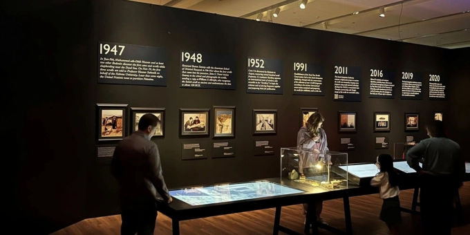
Image Source: Facebook - MBA Design & Display Produkt GmbH
1. Linear Wall Configurations for Chronological Exhibitions
A linear layout is a single path, or a series of parallel runs, that moves visitors from one point to the next in order. It suits anything built on a timeline, because the walk itself mirrors the passage of time.
For example, if you are designing an exhibition about the history of a city, organization, artist, or cultural movement, you may use a linear layout to guide visitors from the earliest period to the present day. Each wall section can represent a different decade, milestone, theme, or chapter.
Linear configurations work for:
- Historical timelines and anniversary exhibitions
- Biography-based exhibits following a life chronologically
- Archival and photography displays meant to be read in sequence
- Educational narratives where order affects comprehension
The cost is rigidity. In an oddly shaped room, a straight path can feel forced, and visitors who want to skip ahead or double back don't have an easy way to do it.
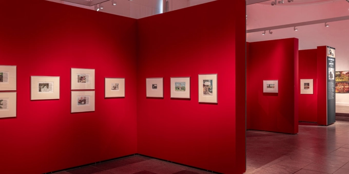
Image Source: MBA World
2. Grid Layouts for Organized Theme-Based Exhibitions
When an exhibition splits into categories rather than following one thread, a grid usually beats a straight line. Walls repeat in rows or bays, and visitors choose their own order between themes.
Grid layouts suit:
- Exhibitions organized by collection, region, or subject
- Multi-period displays without a single organizing chronology
- Shows built from several independent case studies
- Spaces handling large visitor volumes without bottlenecking at any one point
Each section stands mostly on its own, which makes it easier for you to swap one segment out later without touching the rest of the exhibition.
For example, you may want to divide a cultural exhibition into sections such as food, language, music, traditional clothing, architecture, migration, and community life. Each section can have its own wall grouping, graphics, images, and interpretive text.
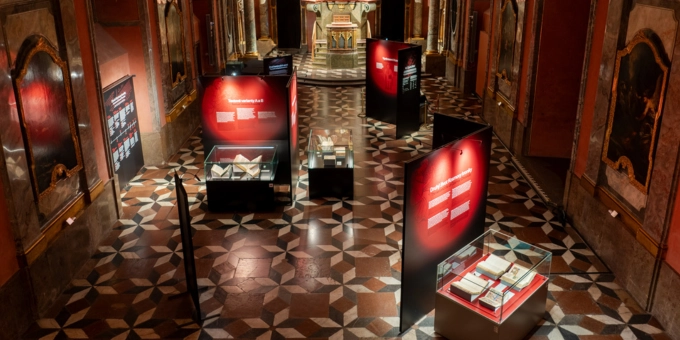
Image Source: Facebook - MBA Design & Display Produkt GmbH
3. Island Configurations for Open Exhibition Spaces
Island layouts use freestanding wall groupings set away from the perimeter, so visitors can walk all the way around them. Each island can carry content on more than one face, which packs in more material without closing off the room.
This configuration suits:
- Open, loft-style galleries with few structural walls
- Sculpture or object-based displays that benefit from multiple angles
- Spaces where visitors should set their own path
- Large open floor plans that need to maximize display area
An island layout reads less like a corridor and more like a room you wander, which can be a useful contrast if the rest of the building has a more directive layout.
The main planning challenge with this configuration, though, is traffic flow. Since visitors can approach each island from different directions, the exhibition needs clear signage and consistent visual cues. Important introductory information should be placed where it can be seen from the main entrance or primary circulation path.
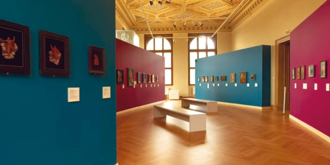
Image Source: MBA World
4. Zigzag or Angled Wall Layouts for Better Flow
Straight walls don't always fit a long, narrow, or oddly proportioned room. Angling them into a zigzag can help you break the sightline down the length of the space and slow the walk down, which can make even a modest exhibition feel bigger than its footprint.
Zigzag layouts help with:
- Long rectangular rooms that would otherwise read as a hallway
- Pacing, by forcing a pause at each turn
- Smaller exhibitions that need a sense of discovery to feel worth the visit
- Keeping the whole show from being visible at a glance from the entrance
Angled walls take more planning around lighting and graphic placement, since nothing sits at a right angle to the room anymore. However, a layout that avoids feeling boxy is usually worth the extra measuring.
When using this type of exhibition wall configuration, plan carefully as pathways must remain wide enough for accessibility, emergency access, and comfortable visitor movement. The angles should support the story, not create confusion.
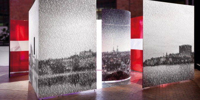
Image Source: MBA World
5. Enclosed or Semi-Enclosed Wall Configurations
Some material needs a room within a room. Enclosing a section with walls gives you acoustic control, controlled lighting, or a clear threshold that tells a visitor they've entered something different.
For example, your museum may use semi-enclosed walls to create a reflection area at the end of an exhibition. Another section may use enclosed walls for a short film, oral history recordings, or a multimedia presentation.
Enclosed or semi-enclosed wall configurations suit:
- Single-narrative or immersive storytelling installations
- Content that needs a warning before entry
- Video or audio pieces that need sound to be contained
- Interpretation that works better without peripheral distraction
A partial opening instead of a full doorway can hold onto some of this control without cutting the space off entirely from what surrounds it.
Moveable Wall Systems for Exhibitions
None of the above wall configurations has to be permanent. Reusable exhibition wall systems let a museum, gallery, cultural centre, library, or event space rebuild the same walls into a different layout for the next show. A linear run used for one traveling exhibition can become a grid, or an island cluster, for the next, with no new construction required.
Moveable museum and gallery walls matter most for:
- Museums running rotating exhibits that want to avoid building permanent walls
- Traveling exhibitions adapting to different venue footprints
- Organizations splitting time between long-term and temporary shows
- Venues that share a room between exhibitions, events, and public programs
Reconfiguring familiar components also cuts installation time compared to building fresh each time.
Combining Wall Configurations With Lighting and Graphics
A wall layout doesn't work alone. It sits inside a system with lighting, printed graphics, object displays, digital screens, and wayfinding, and wall height decides how those pieces behave. Tall walls can carry a large graphic and hold a sightline across the room; low partitions keep the space feeling open and let daylight reach further in.
Worth planning together:
- Lighting angles against wall placement, so glare doesn't hit graphics or glazing
- Graphic scale that stays consistent across different sections
- Digital screens built into the wall run instead of being bolted on afterward
- Wayfinding built into the layout itself, not added as separate signage
If you do this, the layout of the walls will end up doing much of the work. Your visitors will then be able to find their way around without needing a map.
Planning Wall Configurations for Accessibility and Visitor Comfort
A museum wall configuration should be visually effective, but it also needs to be accessible and comfortable for visitors. Check every layout decision against the person walking through it.
- Pathways need to stay wide enough for wheelchair access and for crowds during busy stretches.
- Text and graphics need to sit at a height that works for visitors of different heights, including those using mobility devices.
- Seating built into the flow gives people somewhere to rest without leaving the exhibition
- Emergency routes need to stay clear, regardless of how the walls are angled
This is easier to build in from the first sketch than to retrofit once the layout is set.
Choosing the Right Configuration for Your Exhibition Goals
There's no single correct wall configuration, only the one that fits your exhibition. A few questions can narrow it down for you.
- What type of exhibit is it? Chronological story, or organized by theme?
- How much space is available? Long and narrow, wide and open, or an unusual shape? Will it need to absorb crowds without bottlenecking?
- Are there any installation constraints? How much time and labor are there for setup and teardown?
- What are your long-term plans for the walls? Will they be used for another exhibition in the future?
Most exhibitions end up mixing configurations: a linear entry that opens into a themed grid, or a zigzag path that leads into an enclosed room. The point isn't picking one layout and making the content fit it. It's letting the story and the room decide.
If you’re organizing an exhibition for a museum, a gallery, or your own organization and are considering purchasing an easy-to-install exhibition wall system that allows you to create multiple layouts, Hunter Expositions can help. We offer exhibition wall systems, such as Mila-wall and Scenario, designed to adapt to your space, your narrative, and whatever comes next. Contact us to discuss your exhibition and layout needs.